

Brand Guidelines

Contents
1.1 Introduction
1.2 Purpose & Mission
1.3 Values
1.4 Summary
1.5 Brand on a Page
2.0 TONE OF VOICE
2.1 Introduction
2.2 Proposition
2.3 Characteristics
2.4 Examples
3.0 DESIGN SYSTEM
3.1 Introduction
3.2 Principles
3.3 Examples
4.1 Introduction
4.2 Color
4.3 Variations
4.4 Safe Space
4.5 Usage
4.6 Examples
5.0 COLORS
5.1 Introduction
5.2 Primary Palette
5.3 Accessibility
5.4 Secondary Palette
5.5 Usage
5.6 Examples
6.0 TYPOGRAPHY
6.1 Introduction
6.2 Hierarchy
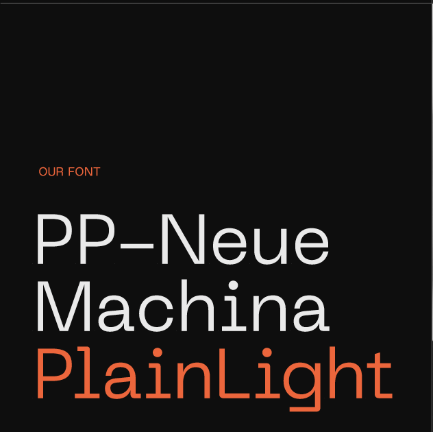
6.3 Default Font
6.4 Implementation
7.1 Introduction
7.2 People
7.3 Location
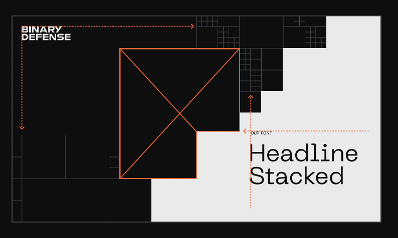
7.4 Defense
7.5 Color
7.6 Examples
8.0 ICONOGRAPHY
8.1 Introduction
8.2 Expressive Icons
8.3 Functional Icons
8.4 Product Icons
8.5 Marketecture
9.0 GRIDS & LAYOUT
9.1 Introduction
9.2 Color
9.3 Type
9.4 Building Grids
9.5 Examples
10.1 Diagrams
10.2 Charts & Graphs
10.3 Takeaways
11.0 MOTION
11.1 Introduction
11.2 Principles
11.3 Animations
11.4 Transitions
11.5 Textures
11.6 Composition
12.0 BRAND IN ACTION
12.1 Apparel
12.2 Exhibitions
12.3 Digital
12.4 Advertising
12.5 Communication
Agile, human-first cybersecurity
Outsmart.
Outlast.
As a team, we have a wealth of knowledge, skills and experience, but we go beyond expertise to outthink the bad guys.
By understanding how they operate, we use techniques they don't expect, so your business gets the best possible protection.
Sharp tactics.
Safe data.
We're sharp strategic thinkers, with the smarts to stay several moves ahead of the bad guys and keep your business safe.
People prioritized.
In a sector that focuses on tech, we take a human-centric approach — it's our job to bring you peace of mind. We build a protective wall around you and what matters to you, so you can focus on the success of your business.
mindset.
There's no one-size-fits-all approach to cybersecurity. We meet you wherever you are, adopt the technology you already use, and strengthen it. Cyber threats keep evolving, but so do we.
Purpose: Human defense.
Mission: Securing data. Protecting people.
Proposition: Agile, human-first cybersecurity
Values: Expert. Maverick. Adaptable. Human.
Think fast.
Fight smart.
Stay human.
Expert. Adaptable. Maverick. Human.
Agile, human-first cybersecurity.
Think fast. Fight smart. Stay human.
Introduction
We have distilled our brand strategy into a concise set of tone of voice principles and pillars.
These are designed to give guidance on how we express and articulate our personality in written form, across a range of different touchpoints.
Agile, human-first cybersecurity.
Expert. Maverick. Adaptable. Human.
We are your ‘Tactical Wingman’.
We show our expertise through smart tactical thinking, and don’t just tell people about our technical prowess. We bring people along on the journey, sharing practical, actionable insights as we go.
We rebel against the status quo, and fly in the face of mediocrity. Our voice feels fresh in the sector, flipping the script with unexpected turns of phrase that emphasize the people involved, as well as our outside-the-box tactics.
We speak with drive and energy, flexing our tone to capture the audience’s attention (and keep it). We constantly adapt to the latest threats, and think on our feet with language too — discussing tactics with precision, while using analogies to make complex scenarios instantly relatable.
You need a trusted ally who’s in your corner and has your back. Our tone cuts through the noise without the jargon: we’re the good guys, here to take down the bad guys. We tell it like it is — our language is carefully crafted, and every word counts.
- Outlast cyber threats with Counterpoint MDR.
- Your tactical advantage: Counterpoint MDR.
- Hack the hackers with Counterpoint MDR.
- Cyber threats evolve. Counterpoint stays ahead.
- Hunt down cyber threats with Counterpoint MDR.
Overview
Smart defense means staying several counter moves ahead.
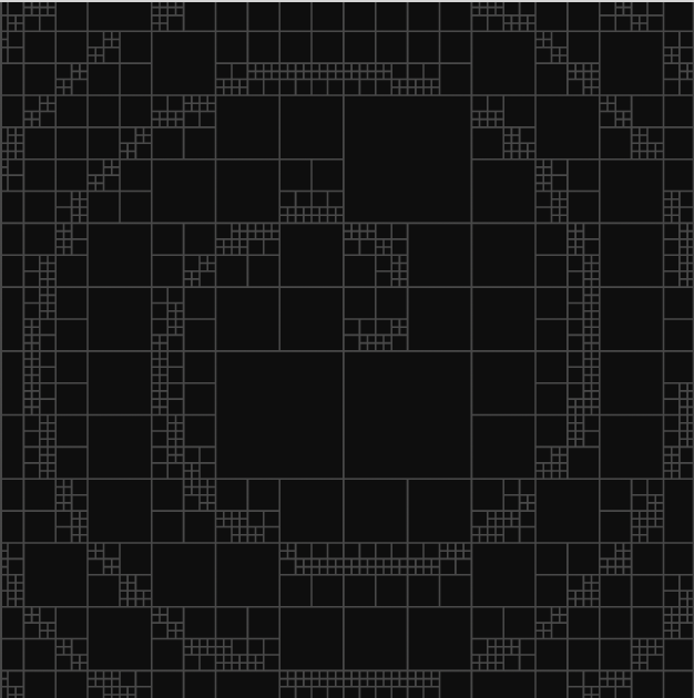
Our brand design system uses a strategic approach through striking visuals that paint ‘threat’ and ‘safety’ in stark black-and-white terms, while bright pops of color add spark and personality.
Contrasting language and visuals show how Binary Defense turns chaos into calm, finding familiar patterns in the digital noise to reassure our partners. Because when it comes to cybersecurity, there are no gray areas.


Visual Principles
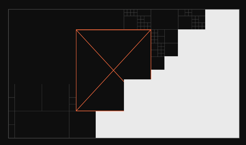
1. Clearing Chaos – Navigating the digital landscape, our grid system purposefully shifts and moves to reveal large areas of clear space that can then be populated with photographic or typographic content.
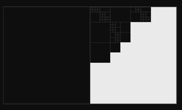
2. Asymmetry – All of our creative output should maintain a sense of asymmetry. This reinforces the programmatic language that's embodied in the Binary Defense visual identity.
3. Layering – We layer color, image and type to create a rich and expressive design system.
4. Alignment – The grid is the bedrock of our brand, to which every element and execution should conform.

Clearing Chaos
Asymmetry
Layering
Alignment